Within the last few months I was contacted by Clay Griffiths, creator of the ultra-robust Headway WordPress Theme, to design their application icon. For those not familiar with Headway, it enables both novice and advanced uses to visually edit themes within WordPress. Being a massive advocate of WordPress myself, and also having a passion for icon design, this project was right up my alley. The icon would represent Headway within the standard WordPress administration panel. Being a "visually editable" theme, the icon clearly and immediately needed to convey that idea – at 48x48 and 16x16 pixels. Inclusively, it needed to both blend in with the preexisting suite of WordPress administration-based icons, and also stand out on its own.
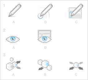
Ultimately, I came up with three designs (in up to three variations each) to present. Concept 1 hit the most intuitive means of representing "editability" with the pencil icon. What I tried to leverage in each concept was the WordPress admin interface's hot color, blue, to demonstrate that Headway is something that lets you take action upon a WordPress theme. So iterations B and C of Concept 1 implemented this approach; the former intimating at a target being edited (and the resulting implications taking place), and the latter showing a layout's column being edited.
Concept 2 moved further into the "visual" part of "visually editable" with the eye icon, first by itself, and second overlaying the "web layout" icon previously used in Concept 1. An "iteration C" of Concept 2 didn't work out.
Concept 3 was a bit more high-level (and three-dimensional), showing blocks that can have action taken upon them (again, the blue), and are also movable/editable. This direction was a nice change of pace from the flat 2D suite of icons, but at the same time still leveraged the established grey tones in the WordPress icon UI. Ultimately, it proved to be too much of a change of pace.

Ultimately, Concept 1C was the chosen direction. For its concept clarity and scalability, the icon is now in use as of Headway version 1.6.