Nearly 2 years ago, my old friend Nathan and I sat down at a downtown Chicago pub to discuss his shift into full-time iPhone app development. During that conversation, we discussed my involvement on a couple projects he had in the pipeline: the Groupon iPhone app, and an idea for another fun little app that would facilitate quick bets of any kind. The former was a massive project with a near immediate start date. The latter was more of a personal pet project, on the back burner until Groupon's app was on the market.
And so, my first experience in iPhone app UI design (and Interface Builder) came in working on the early builds of the Groupon iPhone app: wireframing, prototyping, and initial Photoshop interfaces. Unfortunately the scope and unexpectedly advanced turnaround time became far beyond what I could handle in my schedule. As such, I had to drop out of the project not too long into its early design. It's cool to still see some of my UI design in the final product, however.
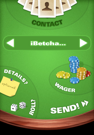
Enter the pet project idea, dubbed "iBetcha". The concept here was a fun-to-use, easy way to place friendly wagers (spur-of-the-moment prop bets, situational wagers, etc.) with friends via email or SMS. The initial idea was to make the interface resemble an actual gambling environment (see right). After a few iterations, this approach ultimately ended up not suiting our needs; too literal, not intuitive enough, and most importantly, not fun.
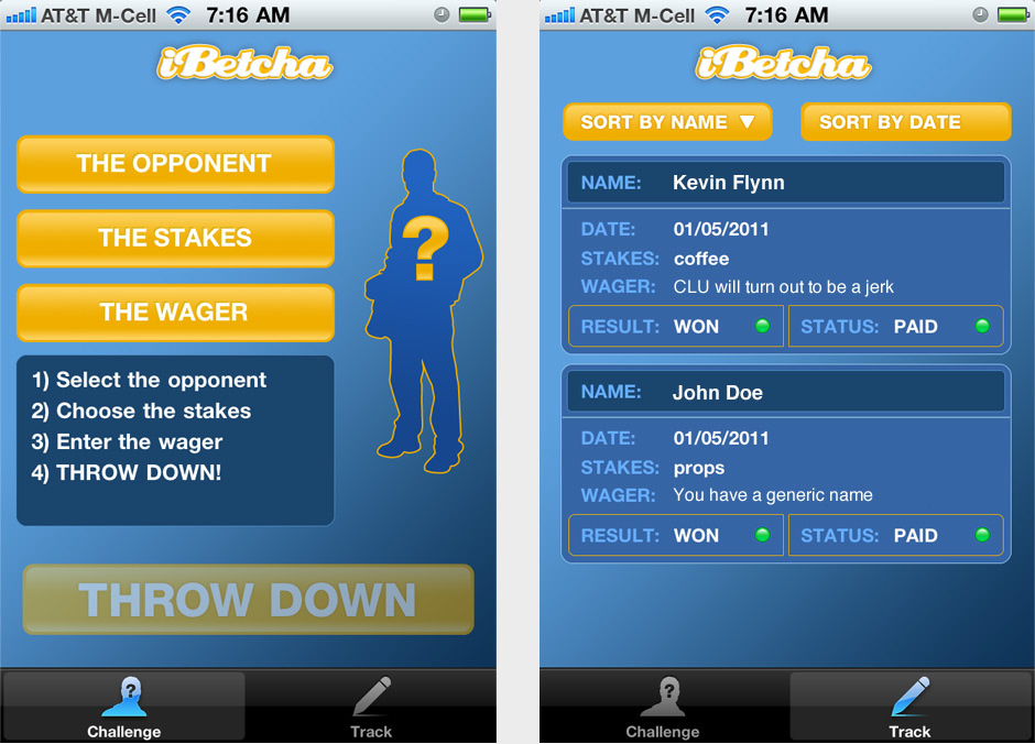
Generation 2 because much more of an app-like interface. Throughout the course of over a year and 14 UI iterations, we arrived at something that we felt was organic, natural, usable, and fun to use. I think something entirely fascinating about the process is how much time it can take to develop a logical, usable, intuitive UI for such a simple series of actions. Usability testing via lots of hands-on usage from multiple parties is the ultimate proof as to whether or not you're on the right track in that sense. A logical, enjoyable series of plain-as-day steps was key. Reinforcement of action items via strong visual queues throughout was the glue to keep it all together: anything orange can be clicked. Any area of white text on dark blue is static data. Visual feedback of the steps being completed (e.g., "Select the opponent" becoming "John Doe") was also vital.
And now, 2 years after we began, this fun little 99¢ app is now available for iPhone on the iTunes App Store. You can bet your friends anything, track if you won or lost, and if you've paid up (or been paid). On the horizon are much more robust apps, but in terms of getting my feet wet, this was a fantastic experience. View the project in the freelance folio.