Some years are fairly "clean", as it were, in terms of highs or lows adhering more to a general baseline of non-extremes. This, by and large, would be considered a good year by many. "No news is good news". For my part, 2014 had pinnacles at both ends of that spectrum; it was a year, however, I wouldn't have had any other way. For the sake of riding the Stallion of Good Vibes into 2015, I'd like to touch on the positives. And there was, blissfully, a copious amount to tally.
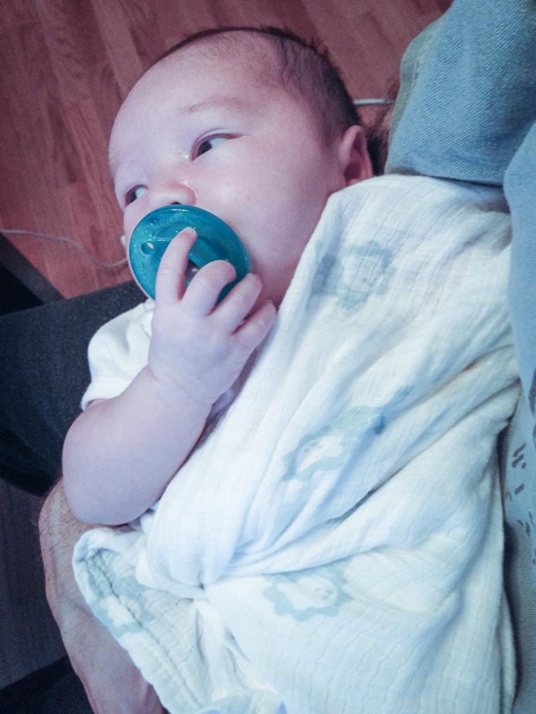
Being the Design Blog, I'll use the lens of creativity to focus upon a couple standouts. First and foremost, however — and the lowest hanging fruit on the happy news tree — this past August my son, Emmett Julian Dauer, was born. Transformative? Beyond any means of articulation. It's unreal with what immediacy one is willing to sacrifice anything and everything for a life so new to existance. Yet here I type, in a flannel shirt gifted with forumla-laced baby vomit, immediately and innately willing to do just that.
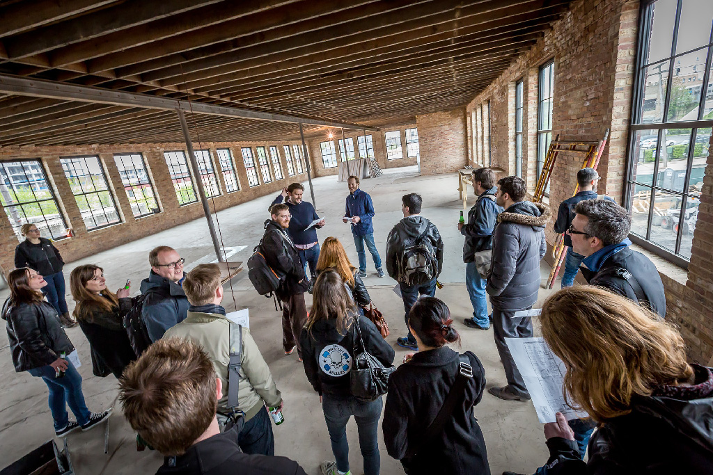
First on the design front, our new Nansen office in West Loop. Watching the space evolve from a raw, unfinished blank canvas (below) into an environment that speaks as much to our culture as it does modernity and comfort, has been a joy to behold. I'm the one on the top-right in the photo staring out the window at our soon-to-be new neighbor.

Situated a block from Google's new massive Chicago headquarters (under construction), the transition to this space, for me, signifies a great deal more than additional square footage. Having been hired to the agency 2½ years ago to start up the creative practice from the ground-up, I've watched us triple in size, and obtain new and genuinely exciting accounts based on our design philosophy, expertise, and work. Having secured our largest design-focused account for a massively exciting brand late in '14, this year could not be more exciting for us.
Transitioning to a personal project, there was The Dead Pixel Society: the collboration of pixel-based icon designers from the mid-90's. Computer users under the age of 30 likely are unaware of, or have very finite exposure to, the origins of pixel-based desktop icon design. With time, nostalgia and grey hairs increase in tandem. To the former, I had a thought one evening this past Summer: get the band back together.
The following morning, on the heels of this seed (Siri, file trademark for new band name: “The Seed Heels”), I poked around my Facebook friends list for some of those icon designers I had kept up with. Actually able to track down quite a few, I opened a group chat window dubbed “Old Man Icon Chat” (which is still quite active) and invited them into the common window. Some of you might remember GUI Galaxy, the Mac / icon design news hub from the late 90’s, which myself and a handful of others co-founded. After unsuccessfully having tried to resurrect GG a few times over the years, I was expecting the concept to not get beyond the feigned / light interest stage. However, for whatever reason, this time things clicked. The concept I presented was as follows:
Create again as an assembled global community, under the exact same archaic, 90’s-era constraints: 256 colors, pixel-by-pixel, on a 32 x 32 canvas.
People were energized at the thought. Names for the group started floating around. Ultimately – considering the high resolution displays of today, and the consideration of the pixel in and of itself as being on life support – we arrived at our moniker: The Dead Pixel Society. We had the general idea – creating under the same archaic constraints – agreed upon fairly quickly. The actual theme of what the work would revolve around, however, took time to evolve. A specific certain movie or tv show? Too limiting for all participants’ tastes. On the theme of working within a “retro medium”, we arrived at an ultimate thought: what if we had still been designing icons all these years, and our tools never evolved? What would those icons have looked like? As such, the initial concept evolved into a mission statement:
We as The Dead Pixel Society honor the humble pixel with icon creations we would have done had we continued designing these past 18 years, under the exact same archaic constraints: 256 colors, pixel-by-pixel, on a 32 x 32 canvas.
As we enthusiastically began to reminisce, a list of peers / sites emerged from the Grunge era, and we set out contacting them. Some, very sadly, proved absolutely impossible to track down. Igarashi Susumu (Mozco Garash). Hideki Itoh (Hide’s Icons). Tomoyuki Miyano (Iron Devil). Others were reachable, and enthusiastic to our cause; the ultimate group consisting of a who’s who of those incredible icon design talents:
- The Iconfactory (Gedeon Maheux)
- IconPlanet (Noel Green)
- GUIGalaxy (Marc Clancy)
- pseudoroom (Justin Dauer)
- Etherbrian (Brian Brasher)
- Mad Science Laboratories (Doc Halpern and Prof. Bowers)
- Icon Icehouse (Ian Harrington)
- Gort’s Icons (Forrest Walter)
- World of Kaos (Søren Karstensen)
- Ilicon (Ilona Melis)
- Ra’s Icons (Raoul Sinier)
To me, in the stead of opening up the project to the general design community right off the bat, this was more or less a litmus test of “is this possible?” It was a proof of concept. Can this finite group of icon designers come together, create new icons under near 20 year-old constraints, hit a deadline, do good work, all in their spare time? It could have very much failed.

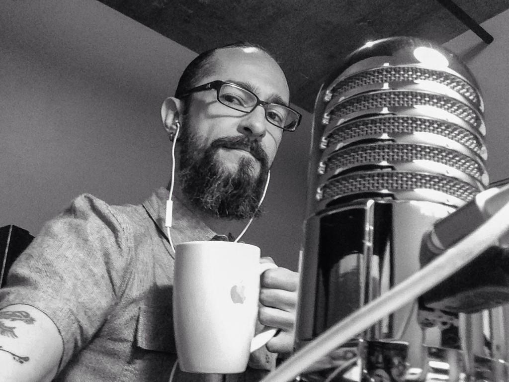
And to the point of failure, particularly relating to my attempts of a GUI Galaxy revival, I knew what my mistakes were: demanding too much time from our contributors (inclusive of news authors posting timely content, original creations, etc.) being paramount. The goal this time around, then, was to keep the barrier to entry as minimal as humanly possible, so the artists could concentrate on doing good work (while making the best use of the finite time they could donate). As such, the site design, some code, copywriting, social media efforts, co-ordination of participants, posting of submissions, and creating my own icons…all were done as the photo demonstrates: holding my then one month old son with one arm (bathed in the glow emitted from my Retina display), and doing everything else with the other. Icon design, left-handed, after a 16-year break from the medium, made for more a more expansive process of iteration than I might’ve hoped.
After a fairly empty Dead Pixel Society inbox, and a few reminder / “…how’s it going??”-esque emails, I was a little concerned. However, once that first icon came through a month in — oh that first, sweet icon — I knew everything was going to be alright. Shaking off the rust, participants began seeing each other’s work, getting inspired from our respective approaches, and the DPS site’s “wall of pixel precision” began to take shape. Being a fellow icon designer from the time, I dropped Jeffrey Zeldman a line about the project. As we began nostalgically geeking out over “the old days” over emails and in Chicago, he offered me the tremendous chance to have a conversation about the project on The Big Web Show, which you can listen to via broadcast No. 121. Taking it a step further, I penned an article on the topic for A List Apart as well. As it stands today, the first Dead Pixel Society collaborative gallery is complete and live, netting out at 72,704 pixels over 71 icons, from 12 icon artists in 3 countries, created over the span of 90 days.

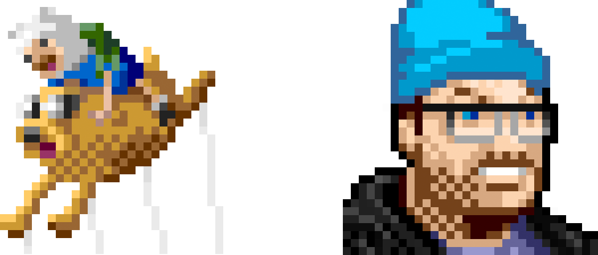
Preceding formalizing and releasing DPS 2, we've kept the pixel rolling via one-offs relased exclusively over social media (all under our self-imposed DPS limitations). For Thanksgiving, we did a mini compliation of Macy's parade balloons dubbed the Pixel Parade. My contribution to the collection was the Finn & Jake balloon, of Adventure Time fame. For Blue Beanie Day, Jeffrey offhandedly asked me over lunch if I'd do some pixel art for the event. In a moment I'd later categorize as a "what the hell was I thinking?" flash, I went home and redesigned his iconic (no pun intended) pixel-based self portrait. I breathed a sigh of relief when he actually used it.
Through the lens of ResEdit-era pixel art — an archaic medium further narrowed under even more archaic constraints — we've pushed ourselves as designers and creative thinkers. Icon design under those conditions, then, is the means toward a creatively refocused end. What I've gained from this collaboration is fuel toward my craft as a designer. Rekindled friendships and some valued new ones. And, being humbled and inspired once again by brilliant creative individuals the world over. Through 256-color icons at 32 x 32 pixels, I've achieved a restored design peace predicated upon no-bullshit visual problem solving. The power of the pixel.
