(Extended version seen on Speckyboy Design Magazine)
About a year ago I wrote an article on the Usability of Résumé Design; a concept that, while well-received, garnered specific feedback from a few voices that I found particularly interesting. Summarized, the gist was that "he uses the word 'usability', but I don't think that's the right term in referring to a résumé". Usability is a condition of anything we interact with: your faucet, a web site's navigation, elevator buttons, a mobile app, or a toilet. Tangible or intangible, the most intuitive means of interacting with something to achieve the desired result is what it's all about. In the case of a résumé, it's making core information readily available and immediately visually scannable. In the case of, say, a video game, it's...well, what is it all about? How does usability play a role in gaming?
Whereas the résumé deisgn article was a more of a tips/pointers/suggestions-type conversation, let's take a more analytical approach this time around. And though we're in observation mode, it should be noted that many of the same principles from the former article apply, for example:
- visual scannability
- color usage as a categorical device
- data presented contextually via visual cues
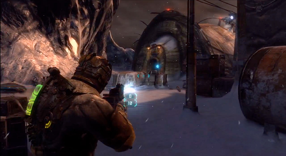
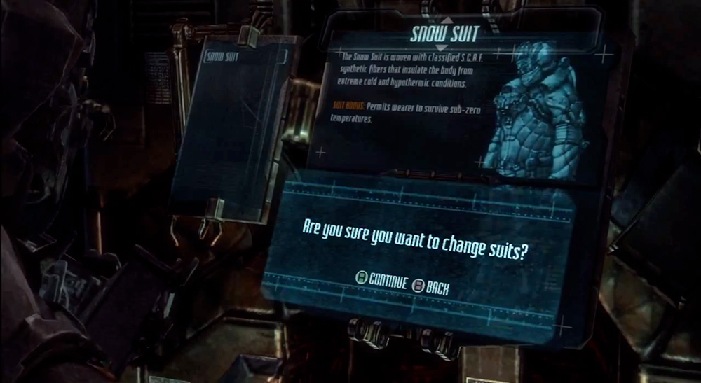
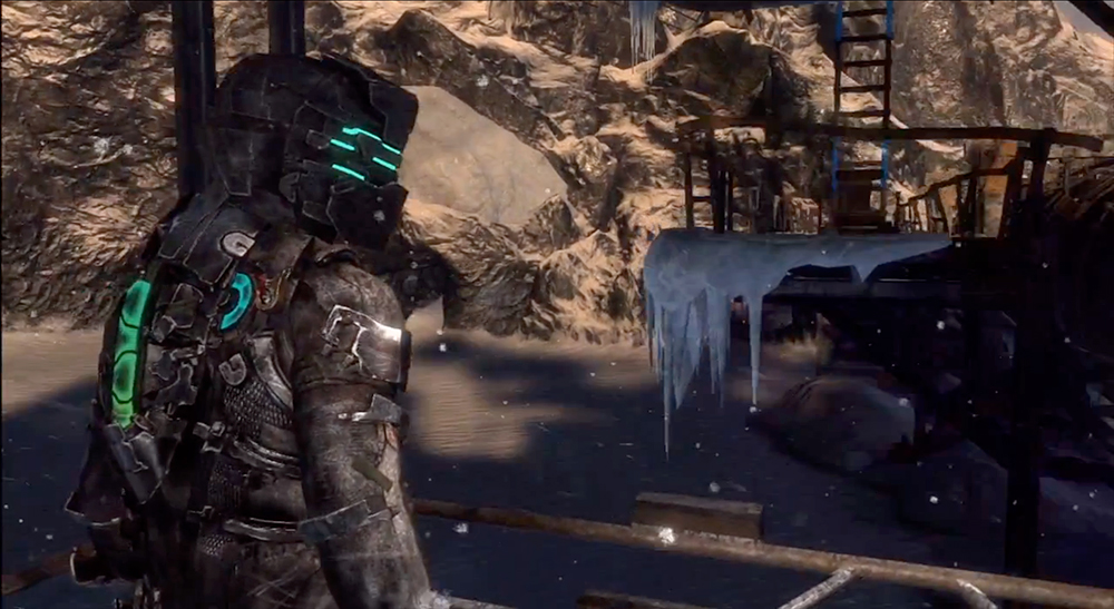
I'm a bit of a gamer myself, and I've been playing a lot of Dead Space 3 lately. The Dead Space franchise is largely known for its sci-fi/horror genre mix, and immersing you in an atmospheric, terrifying experience. Many badasses will tell you the game lacks any true sense of fright at all, however I challenge you to check their boxer shorts after an extended play session (or don't, up to you). While locations and plot vary per game, one of the franchise's constants is it how it completely forgoes the concept of a HUD, integrating many of the interface elements directly into the player's armored suit.
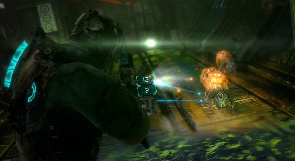
The spinal column-based meter represents the player's health, and the radial gauge denotes stasis, which effectively freezes an object in place for a limited duration. As health lowers from taking damage, the blue bars dissipate downward, concurrently turning yellow when you're in serious trouble, and ultimately shifting to red when near death. Leveraging conventional color usage here (yellow for caution, red for danger) is just smart. The stasis gauge follows similar logic.
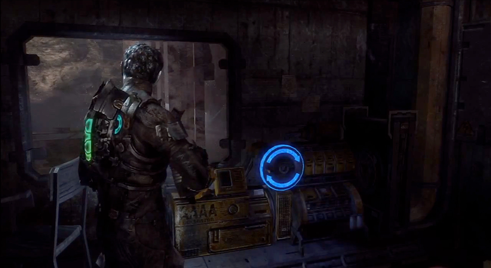
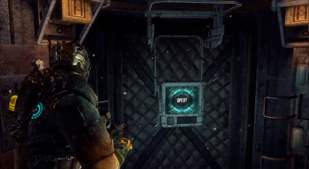
Similarly, as a player fires their weapon, remaining primary and secondary ammunition count is clearly displayed on the frame itself. This smart integration of essential data feedback directly into a game mechanic once again makes the concept of a HUD irrelevant. You're kept in the moment, and immersion is seamless. An attachment projecting a laser target in the below example also inherits the "action" blue.
Beyond organic integration of HUD elements, and as mentioned previously, color is leveraged as a visual cue throughout the game to denote areas of action or user focus. The blue used on the previously discussed suit-based gauges, in particular, is smartly integrated all through the various environments you interact with. Anything that can be lifted or moved via kinesis, any control panel that can be engaged, or any oxygen tank than can be grabbed to refuel your supply while traversing open space, all clearly display the same blue. In a game series which, by and large, has you in intentional dimly lit environments (to facilitate scaring the crap out of you,) having these visual cues throughout still makes these key interactions usable ones.
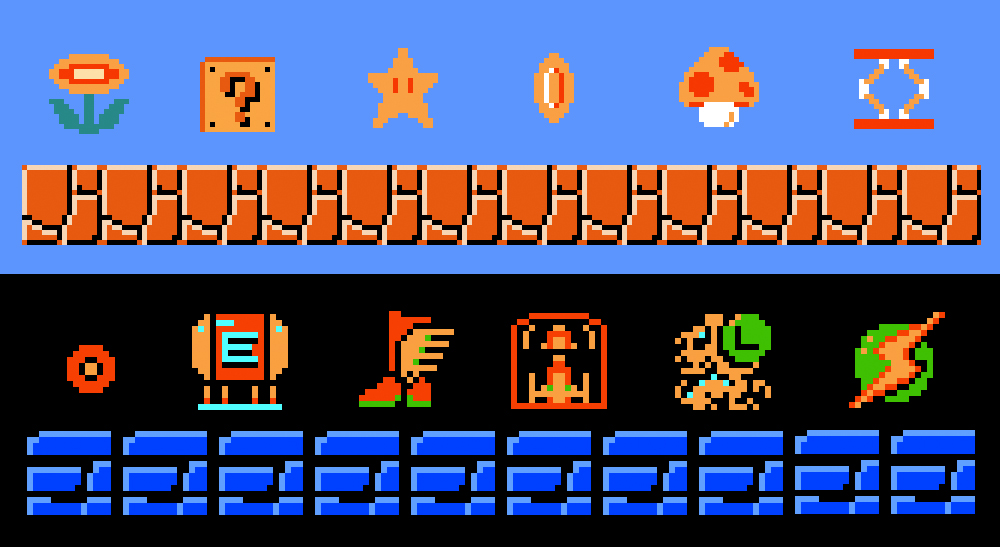
Let's go a step further, and get all retro up in this…article. Usability as a pillar in video game interactions has been a staple for decades. Even in 8-bit NES form, being able to discern what it is I can interact with — amongst all the other movement and distractions on-screen — has always been at the core of a positive gaming experience. Consider the below example of some iconography culled from classics you better be instantly familiar with:
The above scenario is out of any real context, obviously: inclusive of movement, sound, or actual game environments. What we see though is a visual consistency across these items that is intended to train the user (gamer) that "these are things I need to interact with". Beyond color consistencies, some icons may pulse between colors in a similar fashion. Some may move in a solely unique manner that organically trains us to know, amongst all other sensory noise, that the item offers an upgrade, power-up, or some other benefit.
The best implementations of usability are transparent to the user — functioning in an intutive manner, and facilitating organic learning of systems. In the case of video gaming, this can make or break an enjoyable experience. In the case of the crotch on your jeans, this can make or break an efficient opening/closing process in the washroom. I'm looking at you, button-fly closure.